Introducing the redesigned Business dashboard
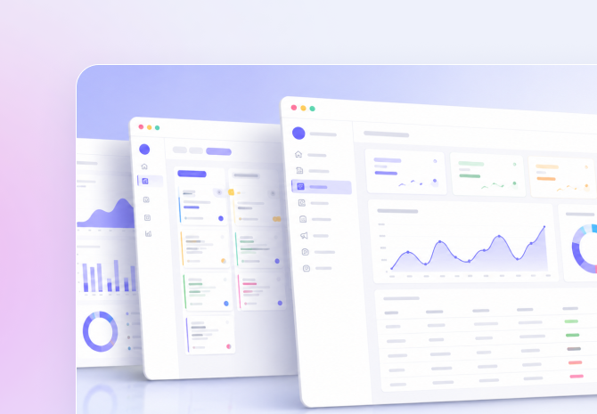
Why we rebuilt it
The old Business dashboard grew one widget at a time over two years, and it showed. Loading felt slower every quarter, and the layout no longer matched how most owners actually check their numbers first thing in the morning.
We started from a simple question: if someone has ninety seconds before their next call, what do they need to see? That question shaped almost every decision in this redesign.
What's changed
The new dashboard leads with three numbers — open leads, tasks due today, and revenue this month — before anything else loads. Charts are lazy-loaded below the fold so the page feels instant even on a slow connection.
We also added quick filters for date range and team member, so a manager can see their own pipeline without digging through settings.
- Sub-second load time on the summary cards with edge caching
- A single filter bar shared across every widget and report table
- Dark strokes replaced with softer, higher-contrast charts for maximum legibility
What's next
This redesign is the foundation for a few things we're testing next: custom widget ordering, and a weekly email digest built from the same data. Both are in early access with a small group of businesses right now.
Meera Nair
Product Lead at Livi Leads
Leading product design and core architecture at Livi Leads. Focused on intuitive SaaS systems that eliminate employee onboarding.
More from the blog

Payroll runs are now three clicks, not three spreadsheets
Here's what changed under the hood, and how to run your first cycle.
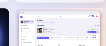
Writing job posts that actually get qualified applicants
A short guide to structuring your listing on the Jobs & Careers page.
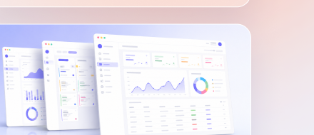
Tracking every document in one place, finally
A customer's take on switching from folders and email attachments to one dashboard.